Lilliput
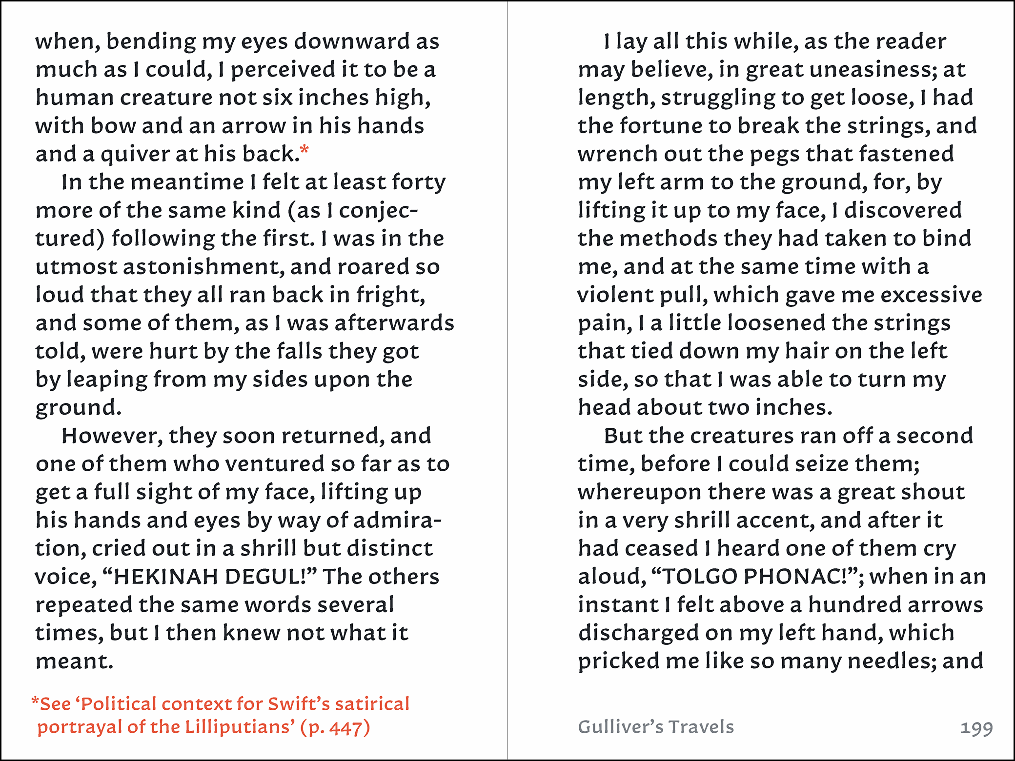
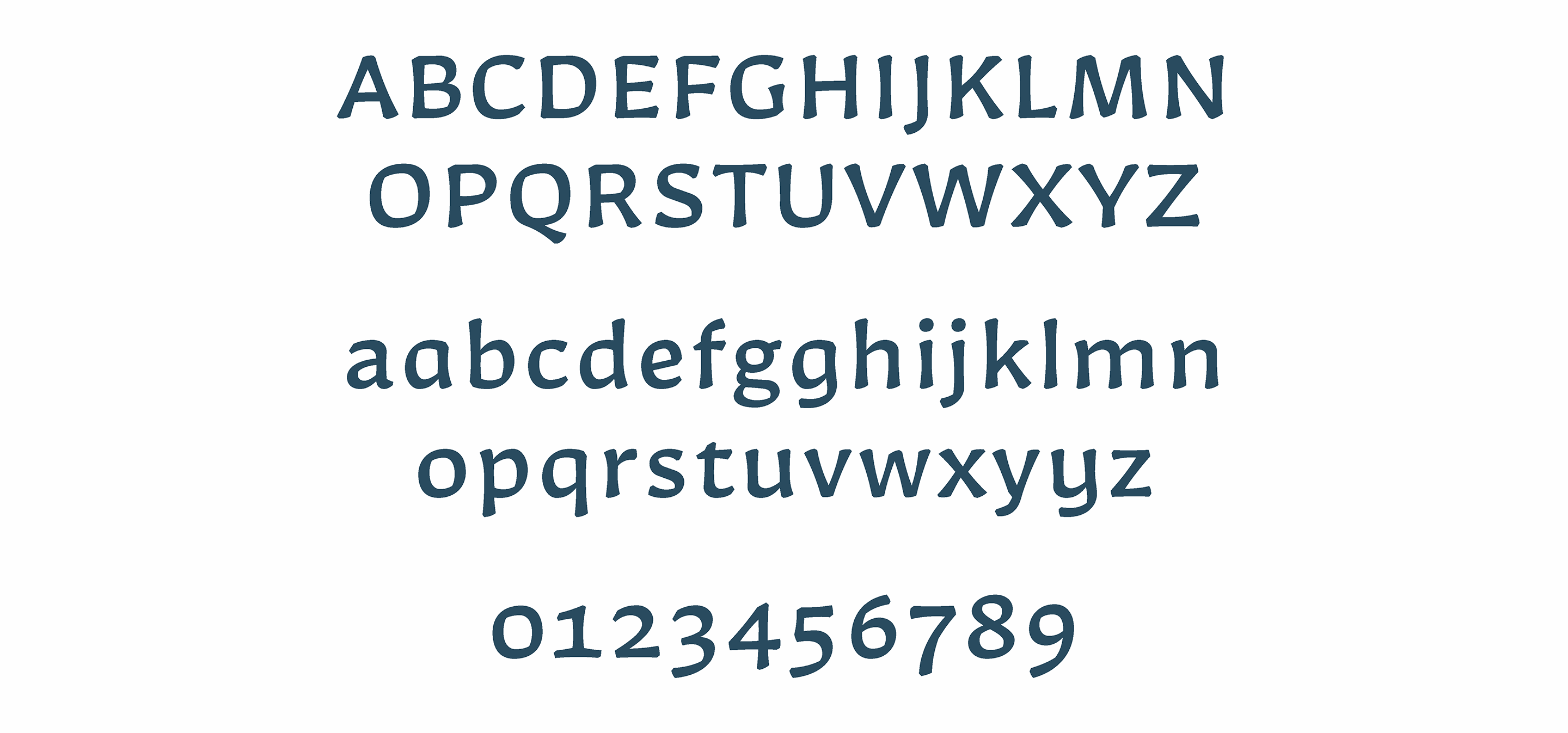
Lilliput is a typeface with a warm and thoughtful voice, intended for reading especially small text at optical sizes from 5 to 12 points.
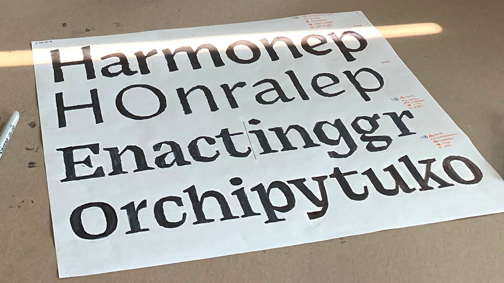
I started drawing this design at Type@Cooper Condensed, an intensive postgraduate program taught at Cooper Union. Our small cohort studied type design, calligraphy, history and theory with leading artists in the field: Ewan Clayton, Hannes Famira, Ryan Bugden, Cara Di Edwardo and Sasha Tochilovsky. With their guidance, we each developed a unique text typeface over the course of five weeks.
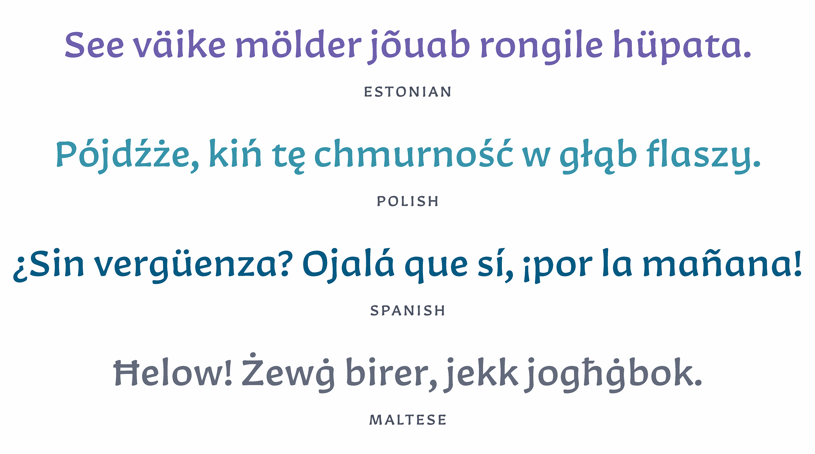
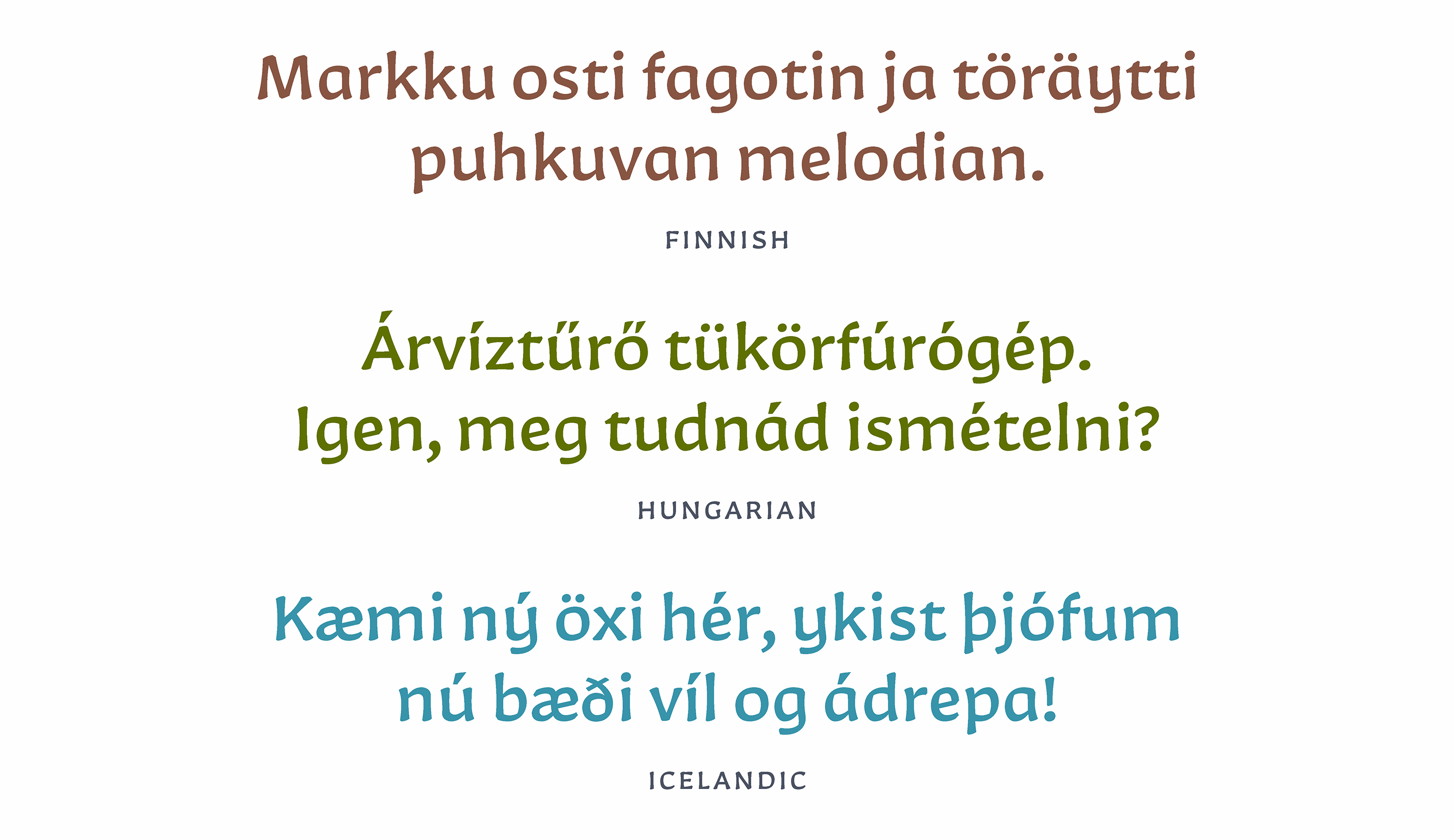
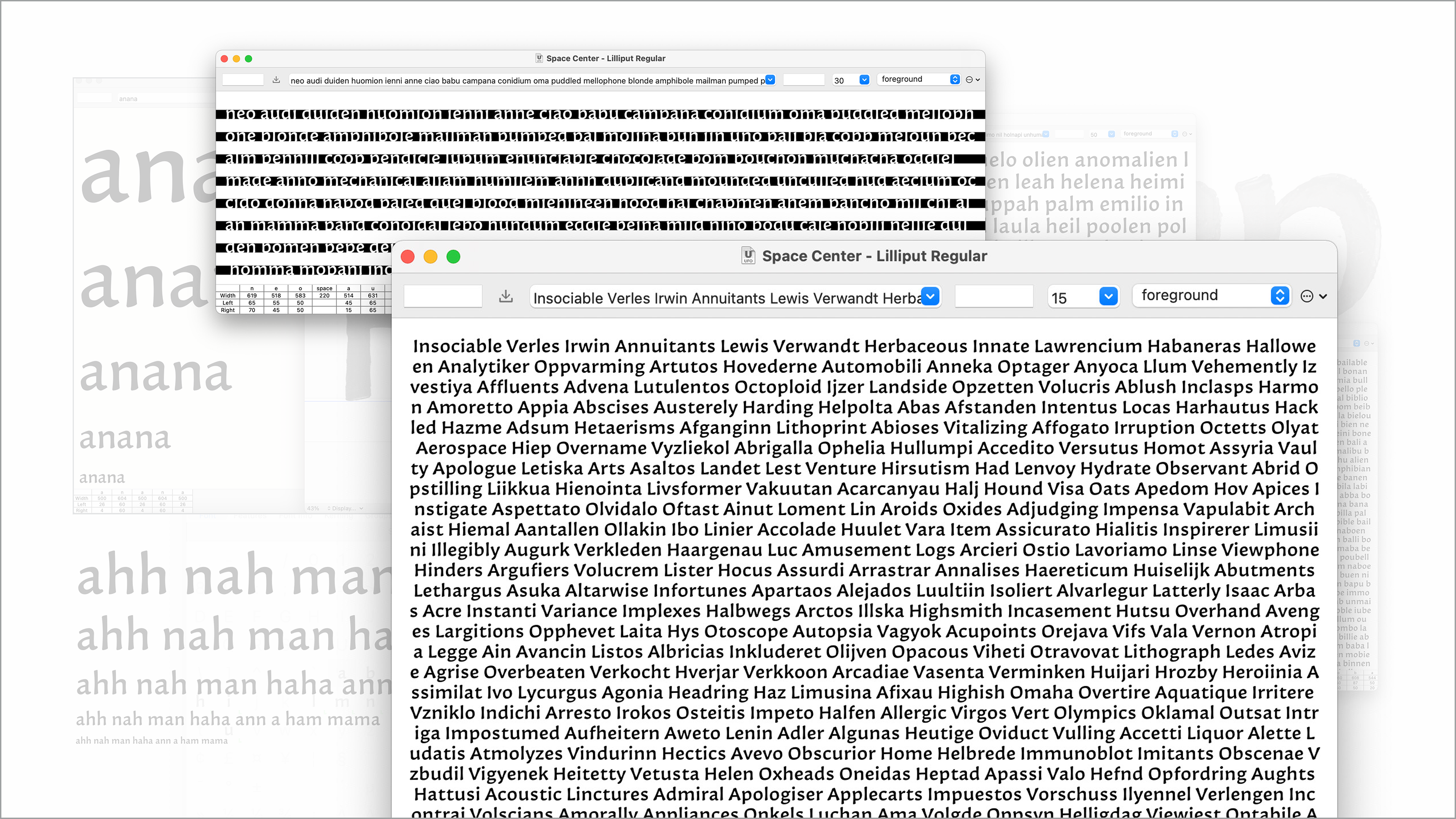
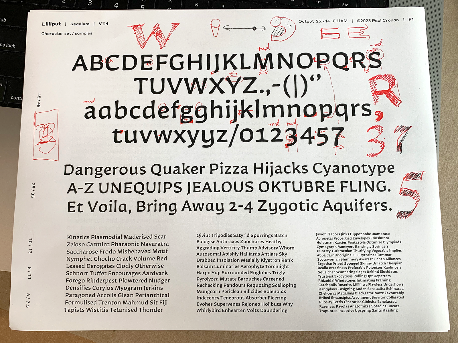
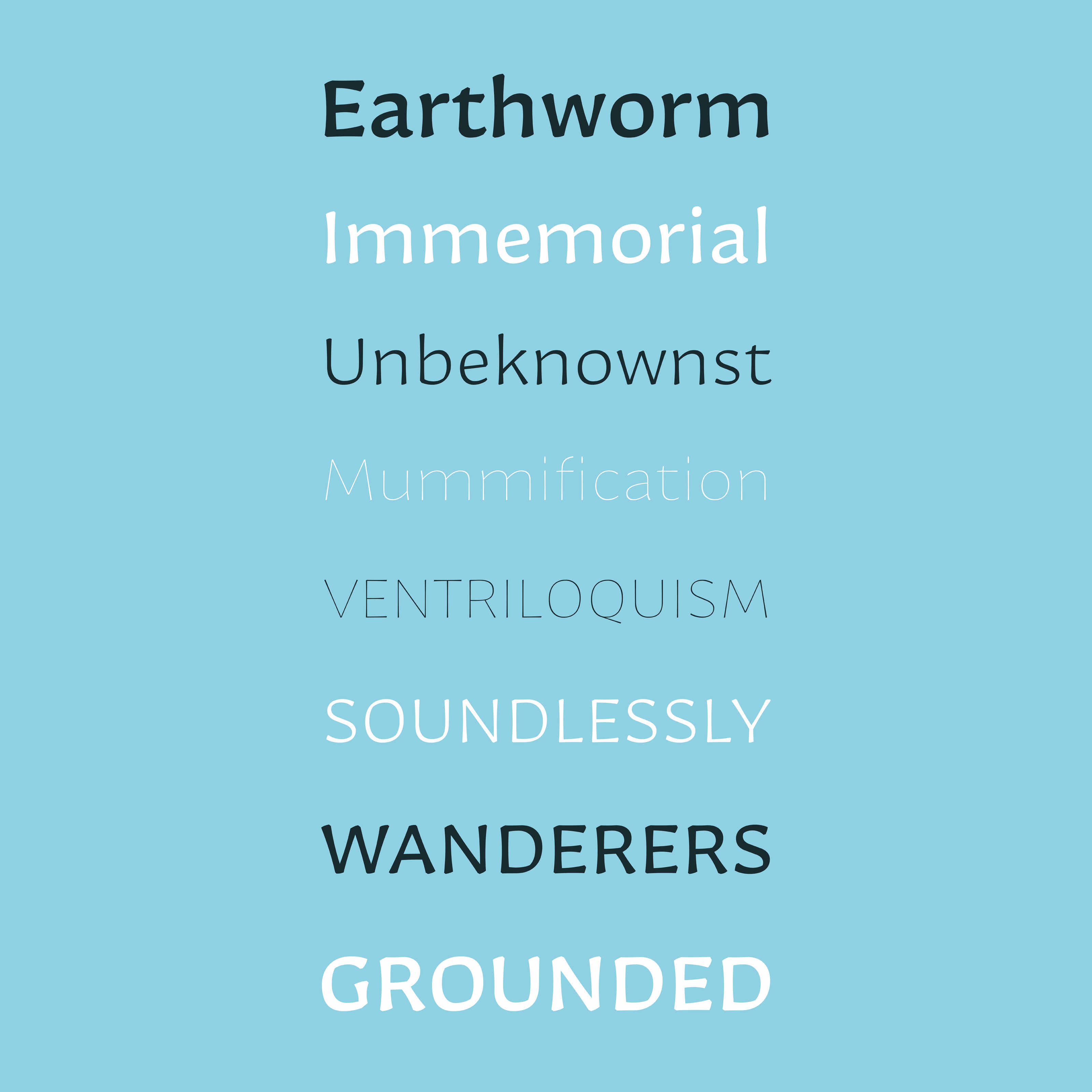
I’ve drawn the first iteration with European language support and am continuing to explore the designspace: thinking about a range of weights, italics, spacing refinements and a display companion face.
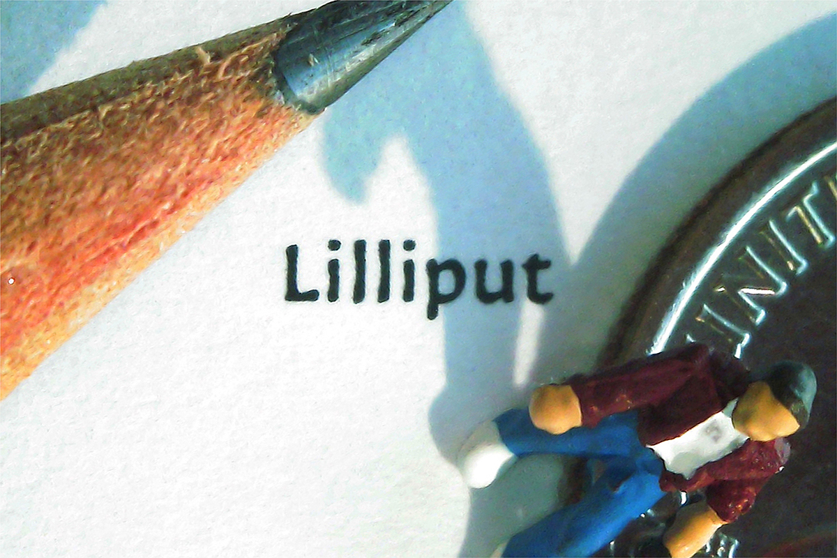
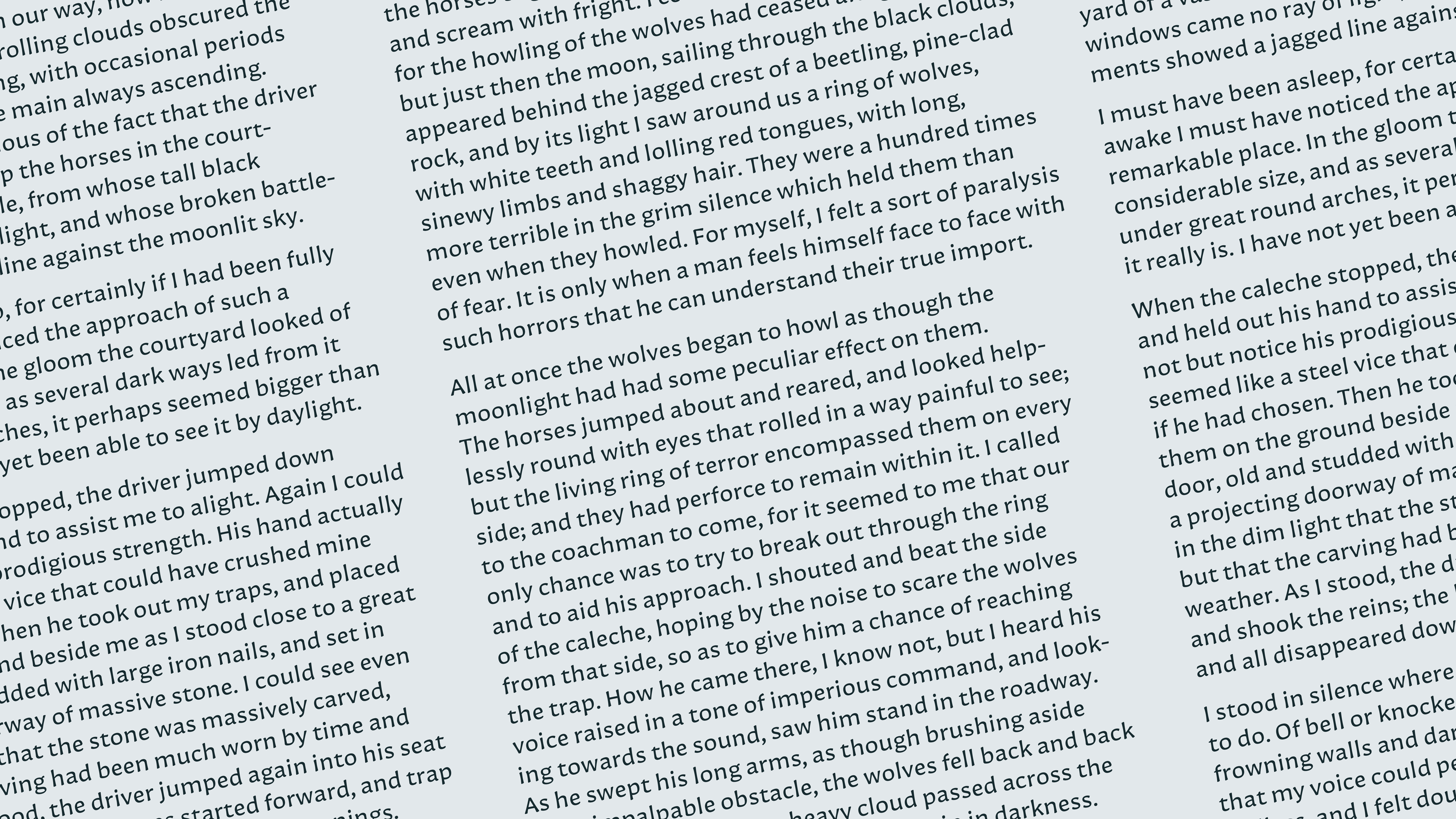
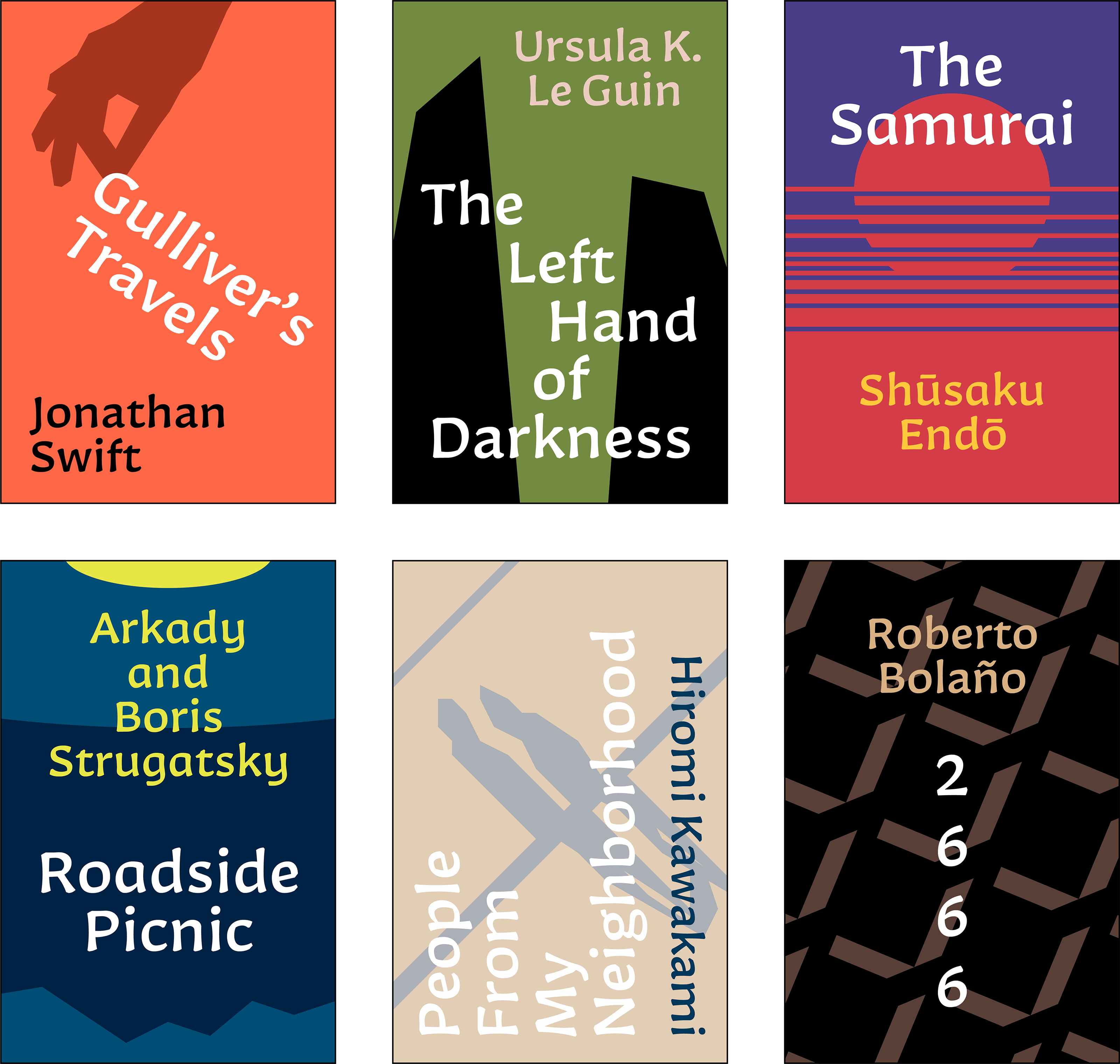
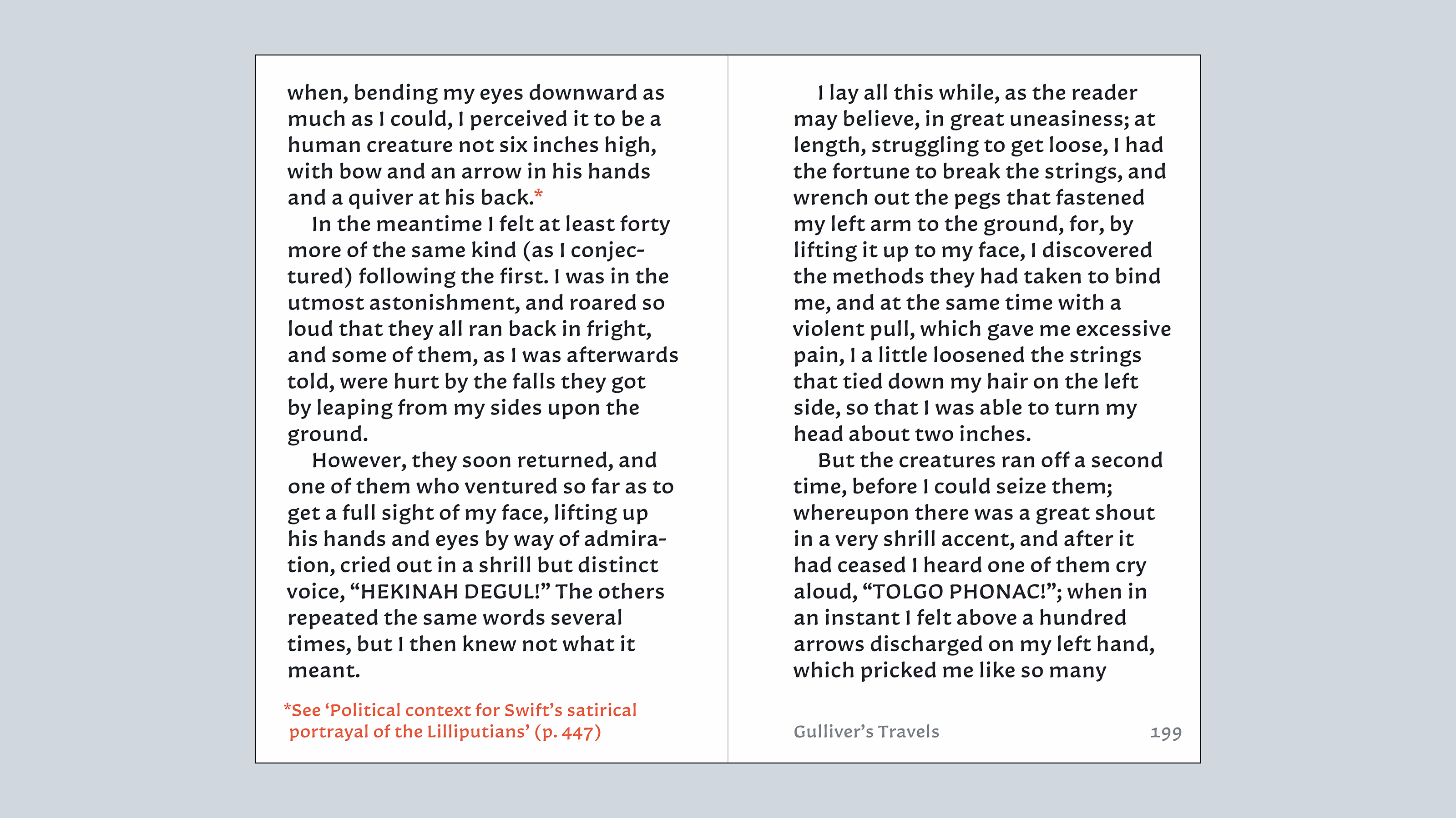
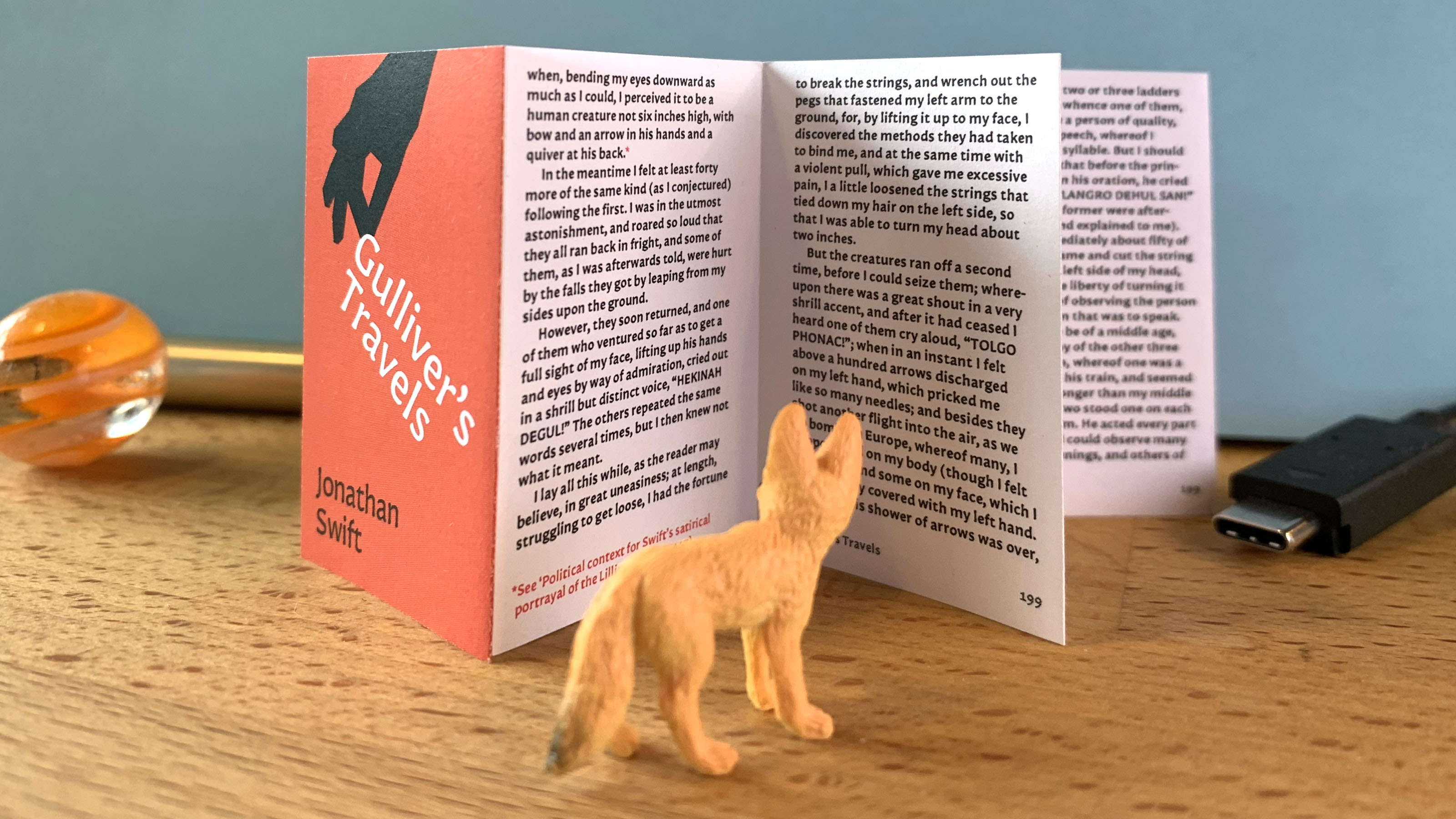
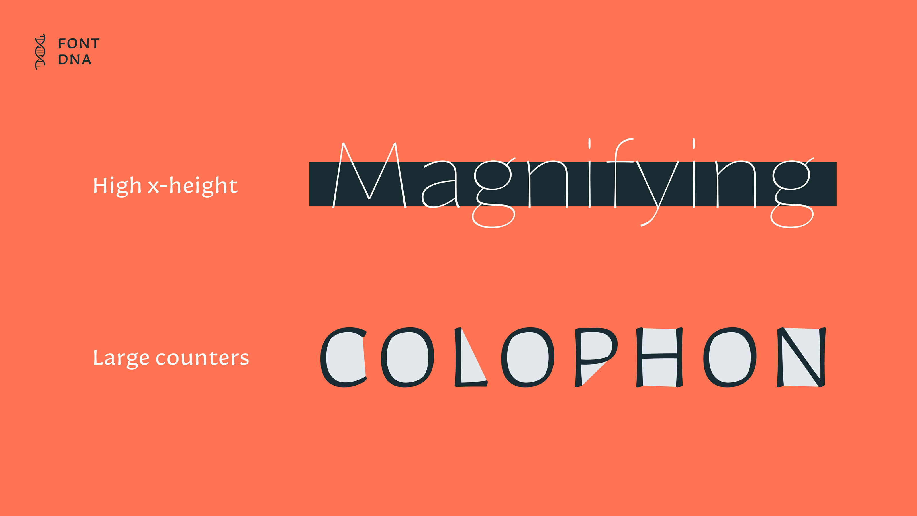
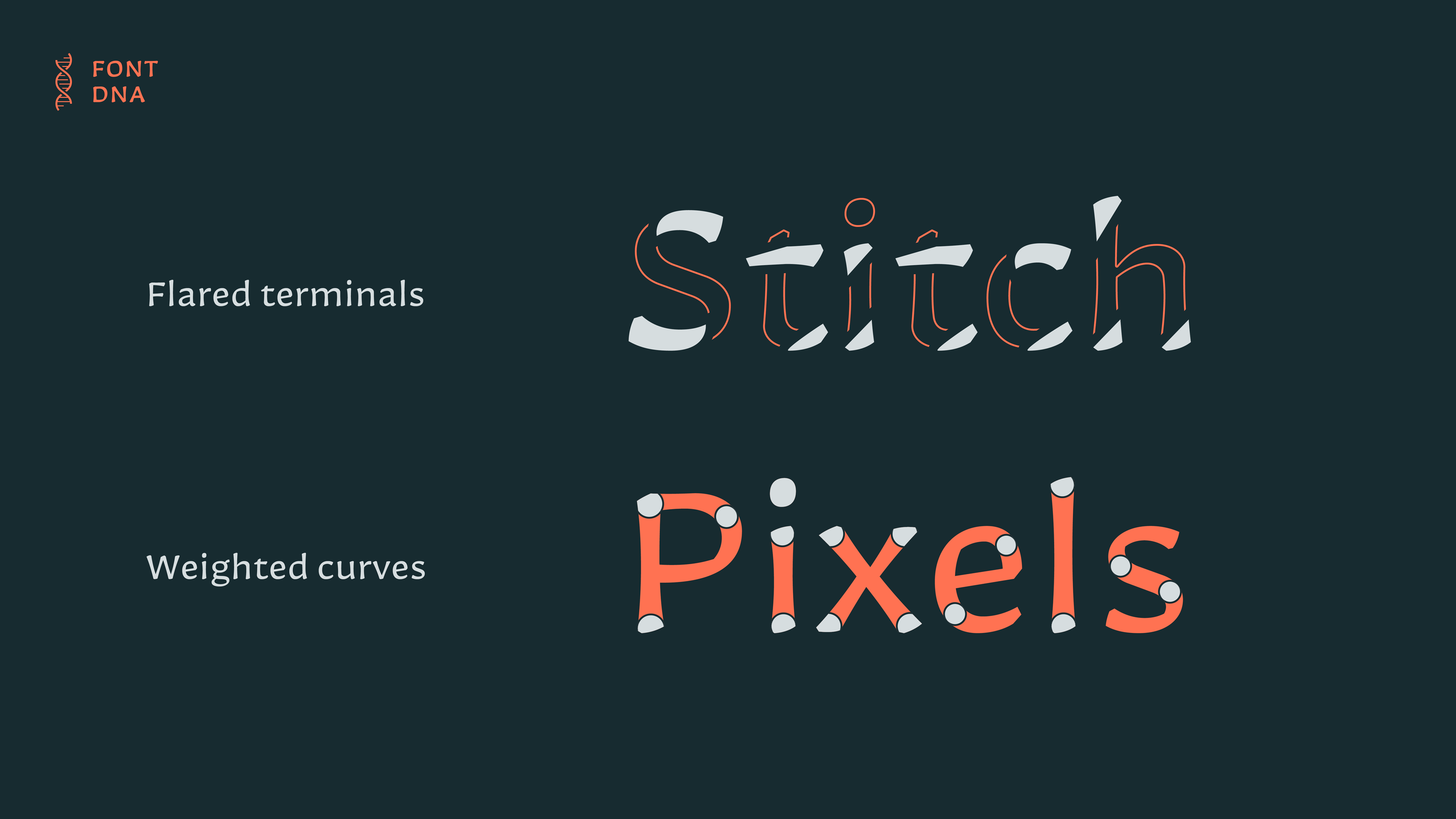
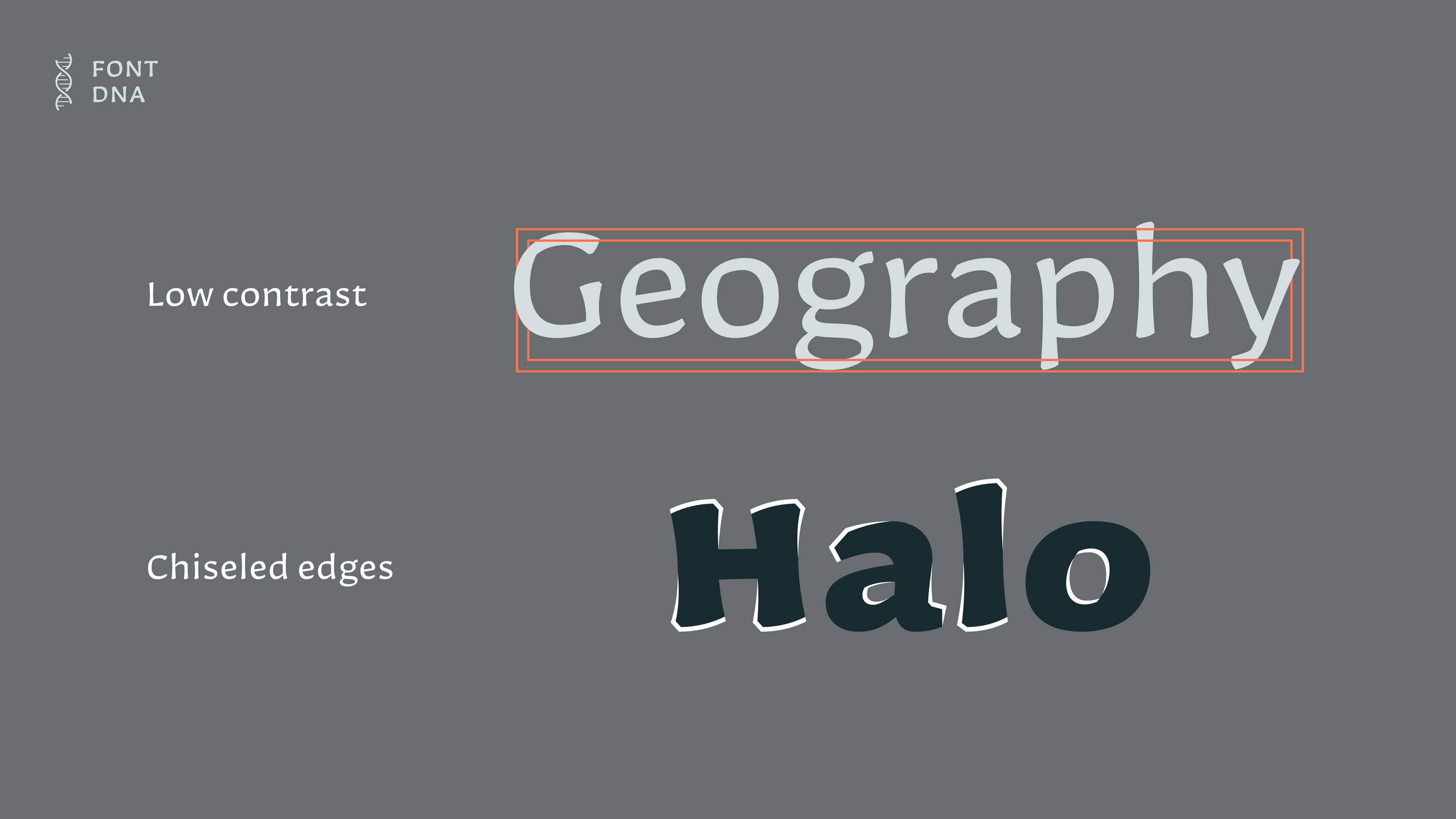
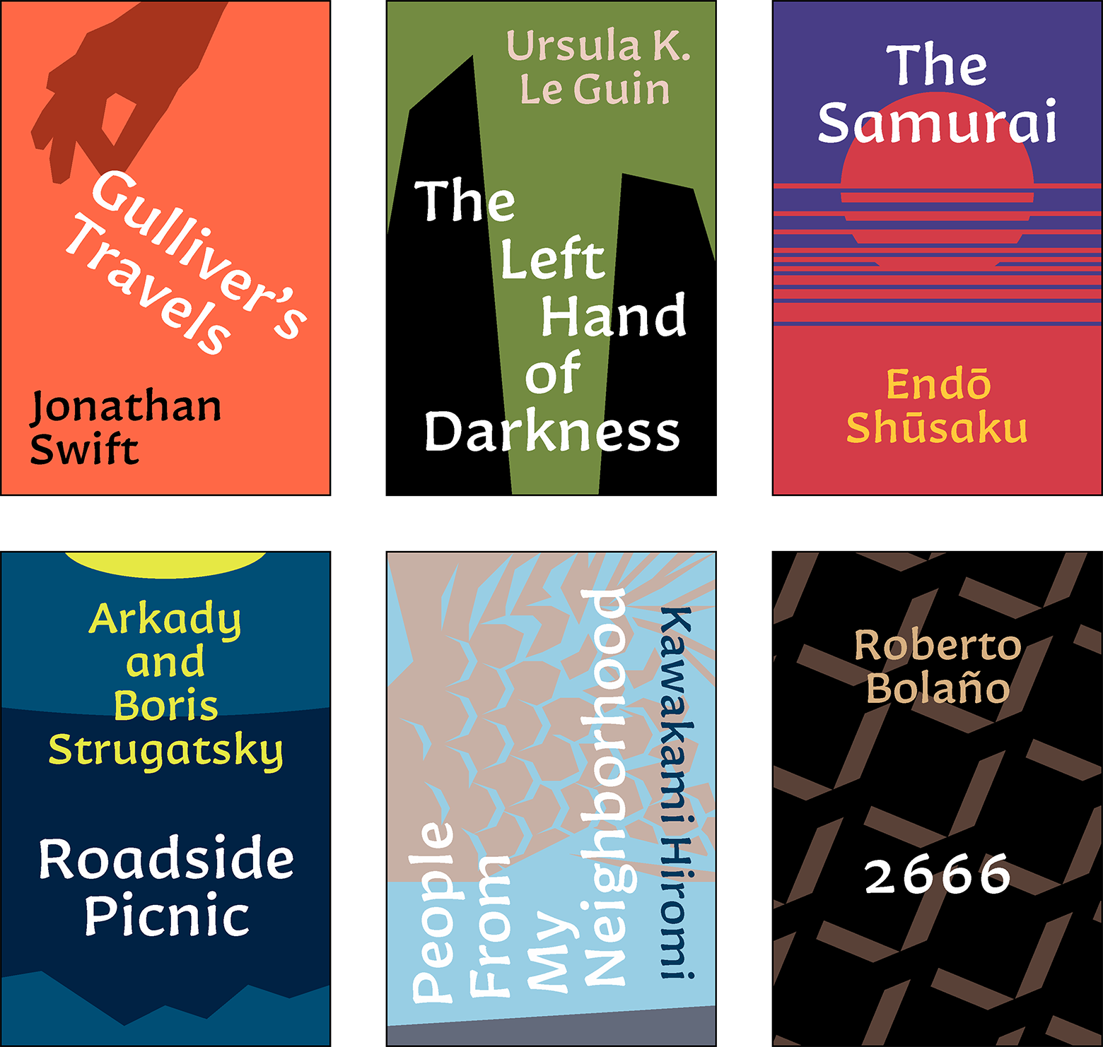
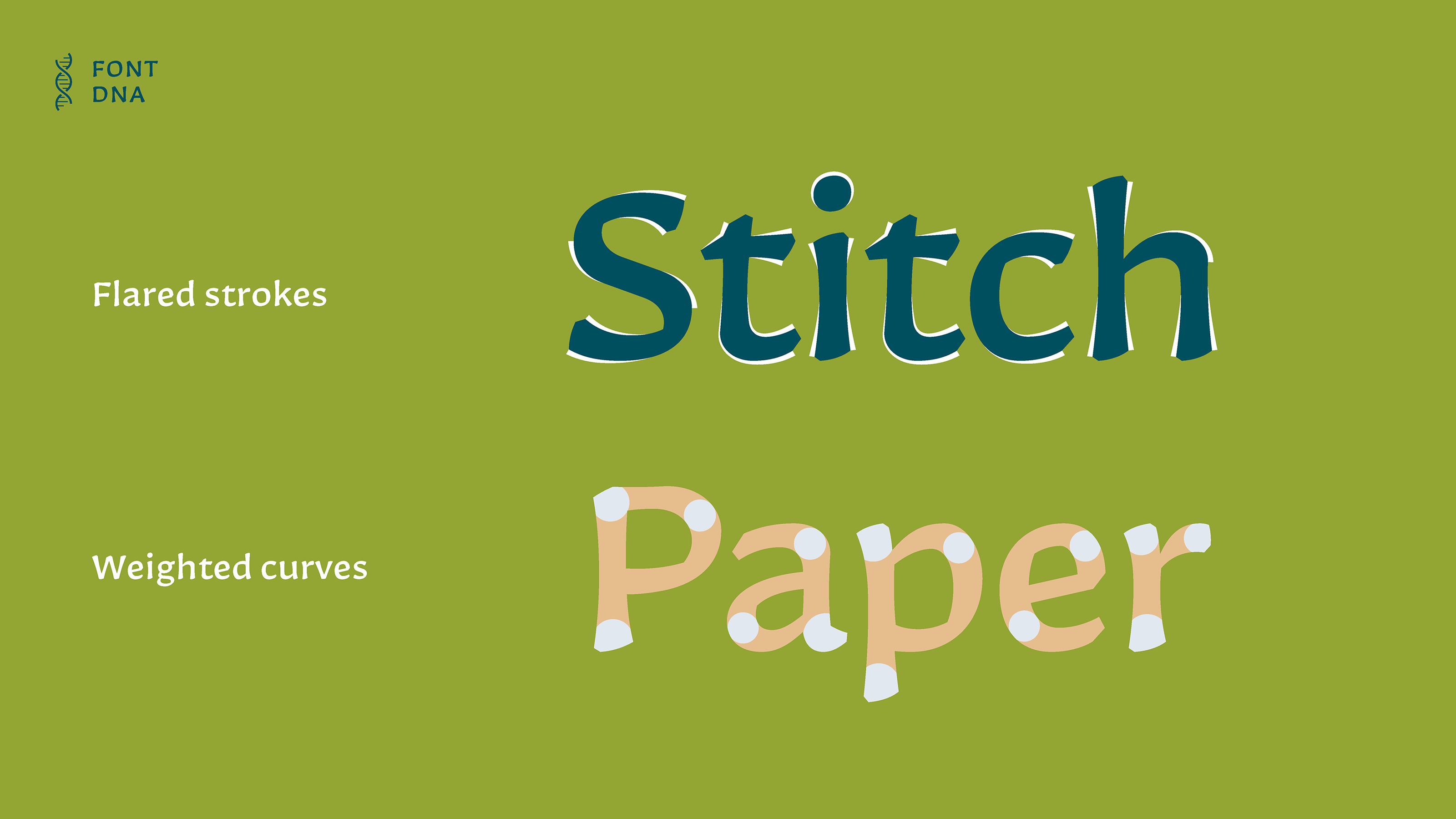
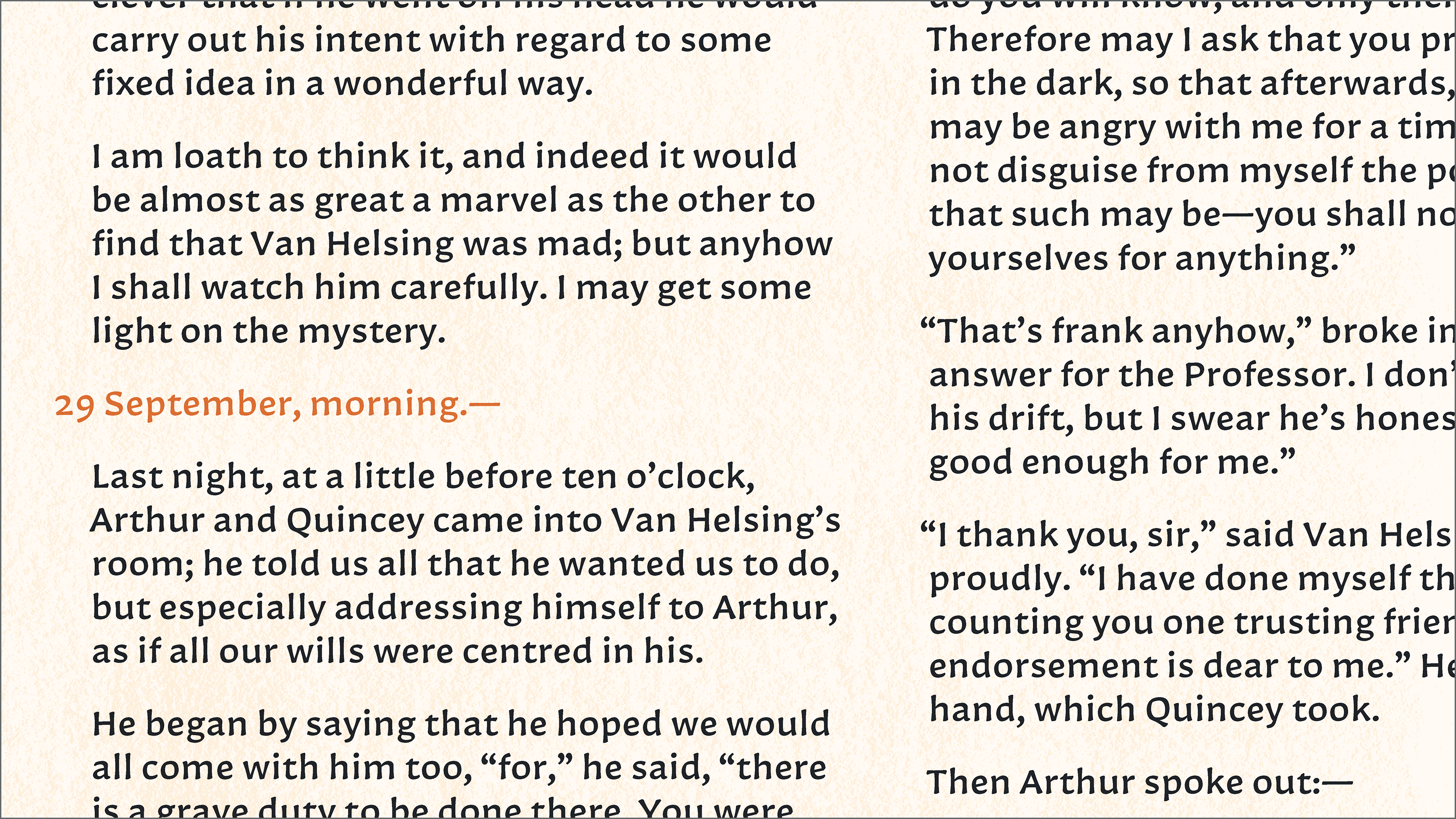
My speculative design brief imagines a series of even-smaller-than-pocket-size novels. Lilliput’s forms are intended to enhance reading at that small scale: a high x-height, compact capitals, subtle translation contrast, slightly broad proportions and flared strokes, among other features.
I focused on these mechanical aspects of legibility to open up the emotional pull of readability: creating an inviting page of text that you want to spend time reading — a fully realized fictional world to escape into.